Design Manifesto
in Highlights, Interactive
25,117
20,125
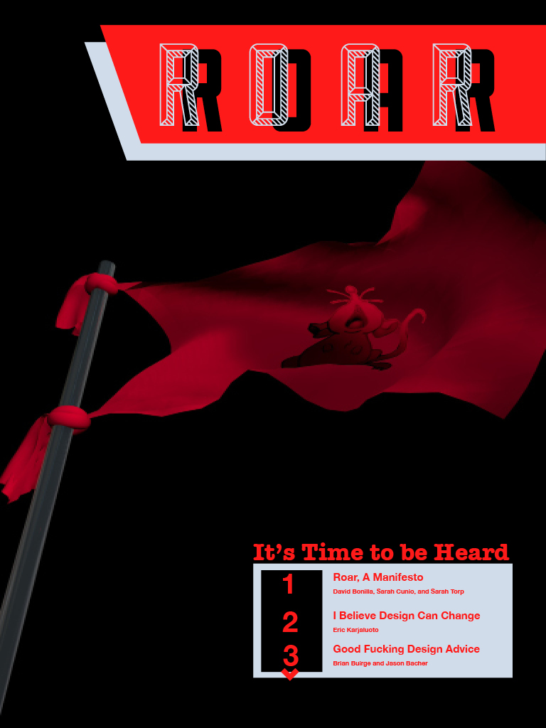
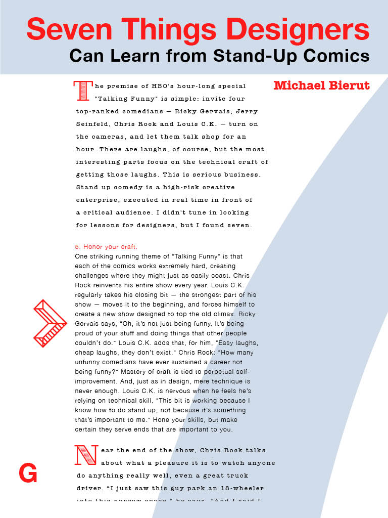
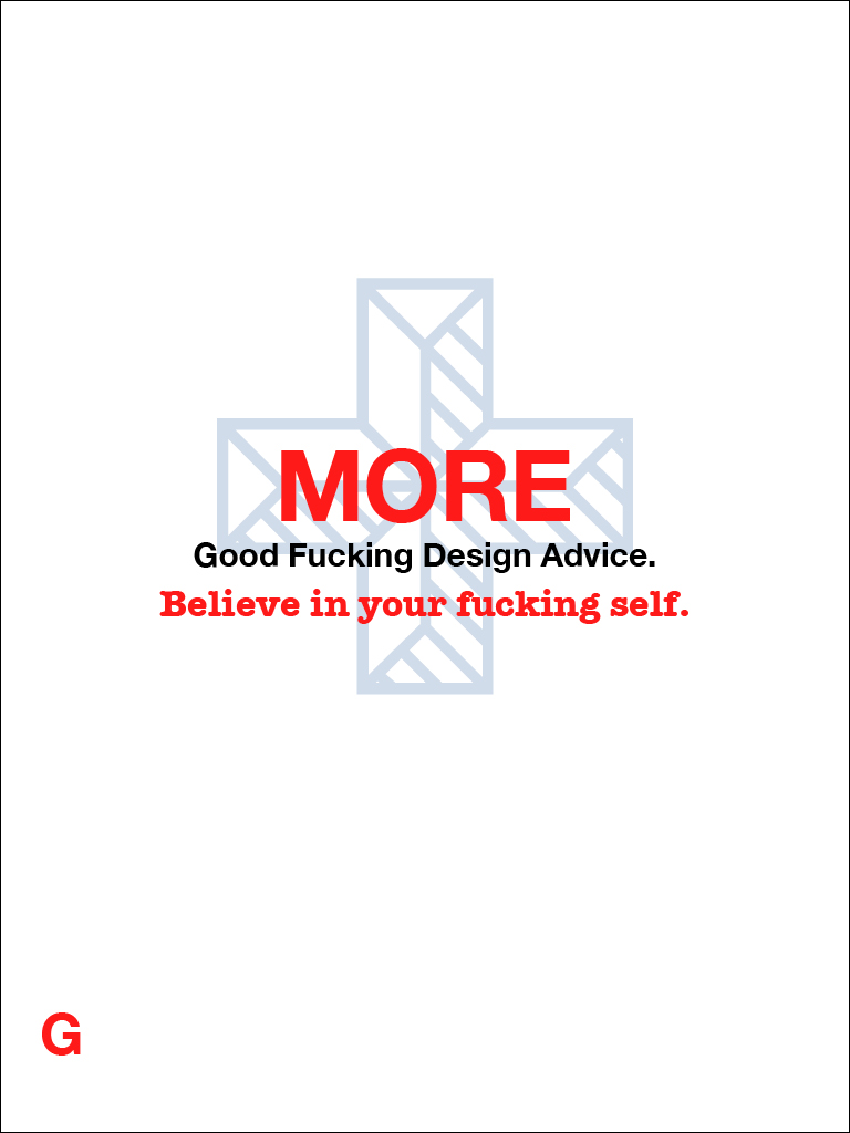
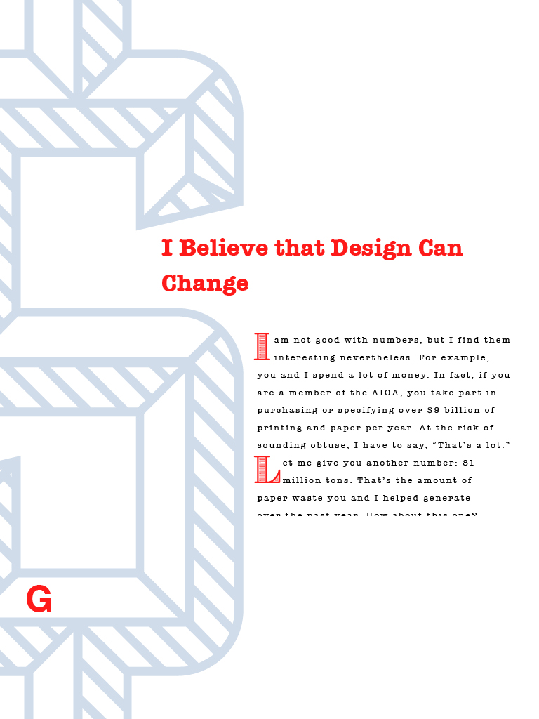
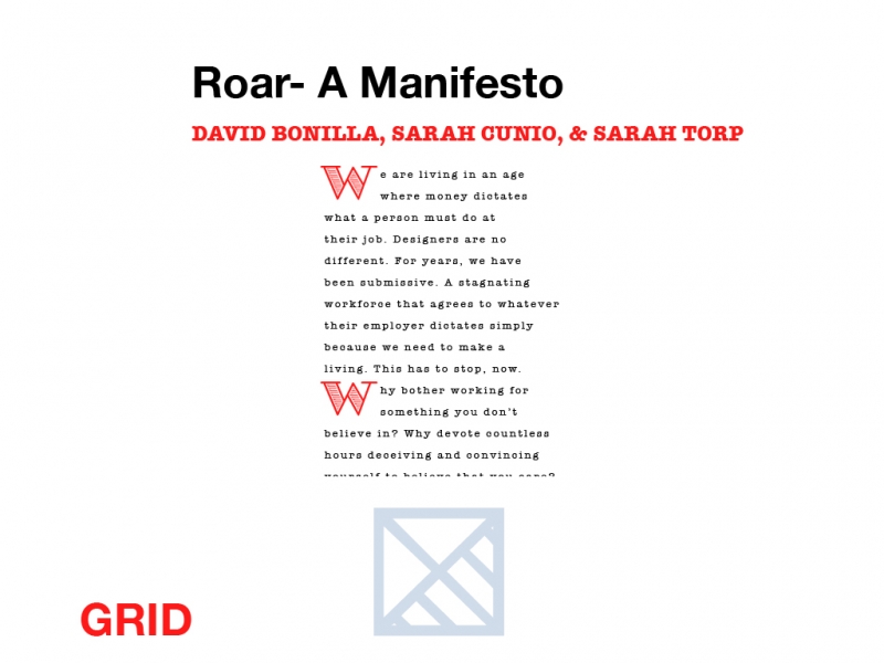
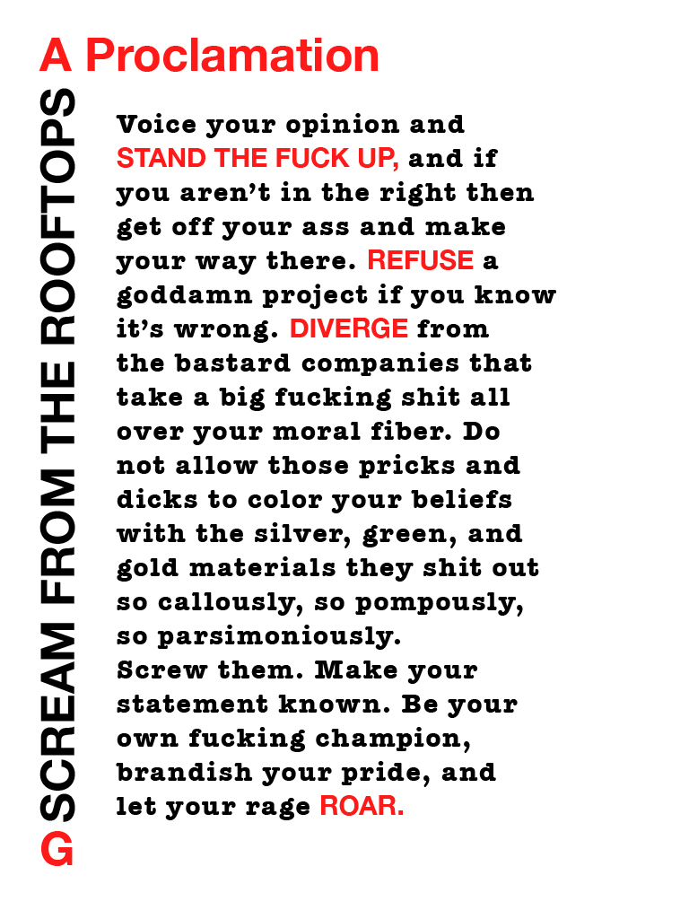
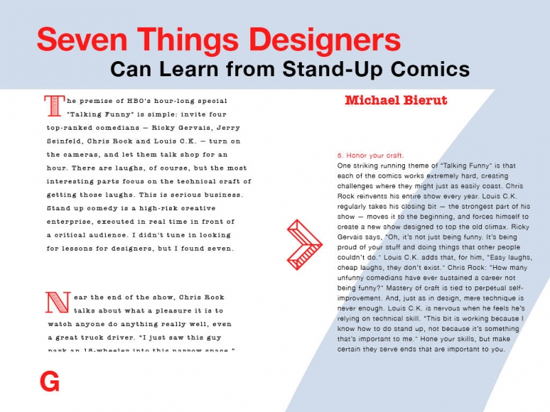
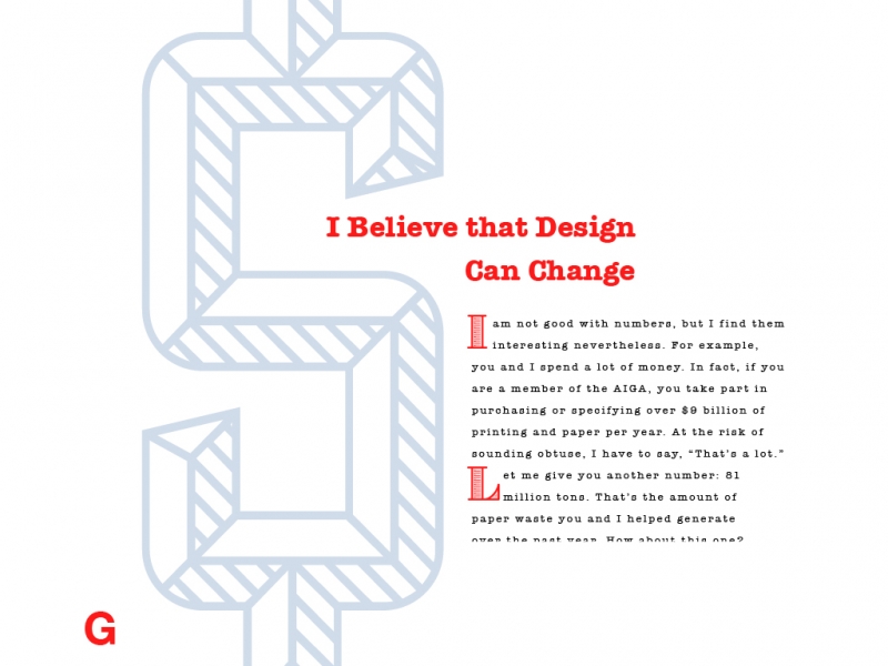
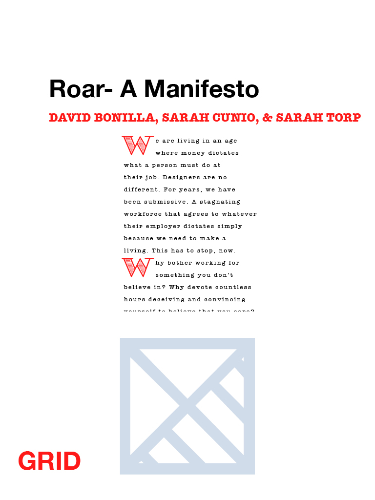
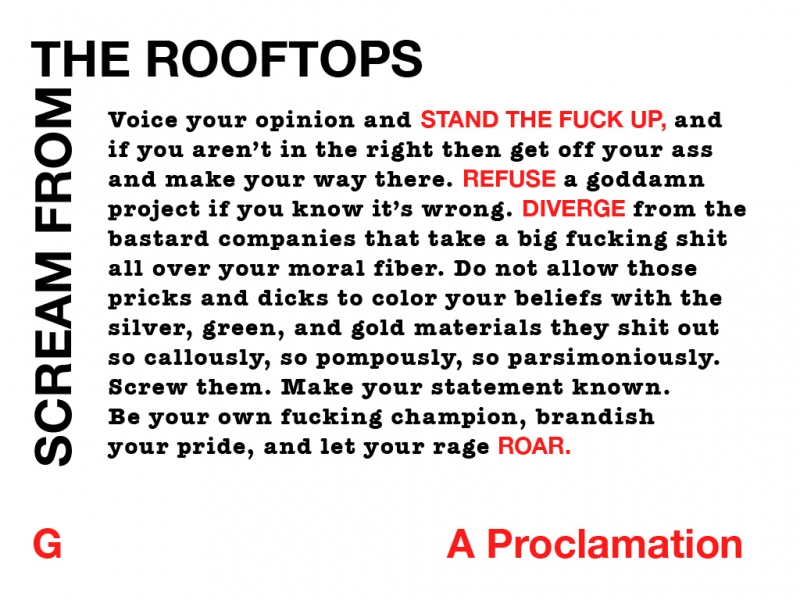
This project was meant to be viewed as an interactive magazine on an Ipad. Eventually, it will be downloadable here. We were expected to create an entire magazine that looked good in portrait and landscape orientations, collaborating with two or three of our fellow designers, and we ended up splitting the eighteen-page project between three of us by doing six pages apiece.
A grid display was required to present itself by the command of a button, my button was the letter “G”. We weren’t allowed to use anything except for text on any of the pages except for the title page, and this is what I came up with as a solution.
RELATED
COMMENTS


